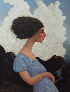
Here are some process shots of a painting I worked on for a few weeks back in August. It started as an idea in my head and evolved as I worked on it. This was an unusual painting for me because I rarely paint an image entirely from my imagination as I did here.
I started with a gouache sketch to get the basic design and pattern that I wanted. Because it can be re-wet, it's easy to move elements around and make large adjustments. This was the only reference I used for the painting because I wanted to make sure that I maintained the pattern of lights and darks.
Then I started the painting on an 18x24" acrylic primed MDF board. I didn't use a preliminary drawing except for some lines with the brush that I soon obliterated. I wanted to work the painting in terms of shapes rather than lines. This first pass was done with OMS thinned oil paint.
I went in with more paint and tried to give some form to the figure and the rock formations. I was very dissatisfied with how unconvincing the dress and the arm looked at this point so I decided to wipe them out and try again.
Here it is with the dress & arm wiped back to a simple pattern. I left those areas alone and proceeded to articulate the cloud(or smoke?) form making sub patterns with the blue-greens to suggest patches of sky and water. I made the hair mass look more wind-swept and believable at this point; it was looking rather heavy before. I also started popping in light red-oranges in strategic spots on the figure, especially around certain edges. I wanted to have a glowing halation effect around the skin to put some life into a rather cold picture.
The palette knife offered a sound solution to my struggle: I could create variation through texture within the masses while still preserving the proper value. I used the knife to paint the dress with subtle variations suggesting form and translucency in certain areas. The broken color and value shifts gave a satisfying shimmer to the dress. I also started knifing on an initial layer of white in the back. I planned on building it up further after it dried.
The finished painting. I really tightened up the face and built up some nice texture in the cloud/smoke mass that I lightly glazed over for a richer look. One nice thing is that I kept pretty faithful to the basic design. Any deviations from my original sketch were ideas that came to me mid-process and were (for the most part) improvements.


No comments:
Post a Comment