Thursday, December 22, 2011

Light Profile


Drawing with a LED light pen.

Thursday, November 24, 2011

Peter Drawing


A sketch of colleague and fellow artist, Peter Noonan. Made on our pilgrimage to the Brandywine Museum in Chadd's Ford PA. Oil on panel. 

Wednesday, October 19, 2011

Studies

I've been sick for the past several days so I've had some time to devote to a few studies.

[graphite & colored pencil on paper]

A Vanderpoel study:
[graphite on paper]

And a couple Zorn studies:
[graphite on paper]

[Golden Open Acrylic & charcoal on cardboard]

Tuesday, October 11, 2011

Dusk


Charcoal & acrylic on cardboard.

Friday, October 7, 2011

Lizzie

Here are some process shots of a painting I worked on for a few weeks back in August. It started as an idea in my head and evolved as I worked on it. This was an unusual painting for me because I rarely paint an image entirely from my imagination as I did here.

I started with a gouache sketch to get the basic design and pattern that I wanted. Because it can be re-wet, it's easy to move elements around  and make large adjustments. This was the only reference I used for the painting because I wanted to make sure that I maintained the pattern of lights and darks.


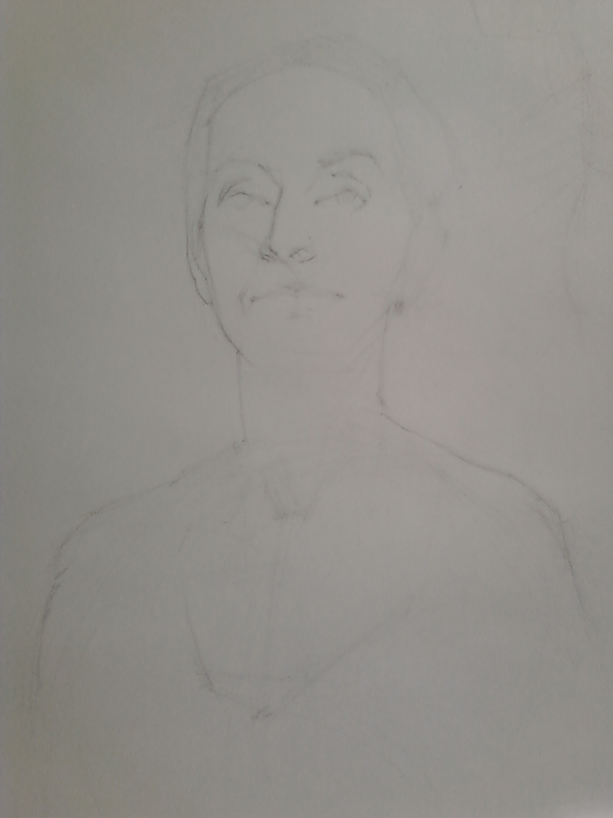
Then I started the painting on an 18x24" acrylic primed MDF board. I didn't use a preliminary drawing except for some lines with the brush that I soon obliterated. I wanted to work the painting in terms of shapes rather than lines. This first pass was done with OMS thinned oil paint.


I went in with more paint and tried to give some form to the figure and the rock formations. I was very dissatisfied with how unconvincing the dress and the arm looked at this point so I decided to wipe them out and try again.


Here it is with the dress & arm wiped back to a simple pattern. I left those areas alone and proceeded to articulate the cloud(or smoke?) form making sub patterns with the blue-greens to suggest patches of sky and water. I made the hair mass look more wind-swept and believable at this point; it was looking rather heavy before. I also started popping in light red-oranges in strategic spots on the figure, especially around certain edges. I wanted to have a glowing halation effect around the skin to put some life into a rather cold picture.


The palette knife offered a sound solution to my struggle: I could create variation through texture within the masses while still preserving the proper value. I used the knife to paint the dress with subtle variations suggesting form and translucency in certain areas. The broken color and value shifts gave a satisfying shimmer to the dress. I also started knifing on an initial layer of white in the back. I planned on building it up further after it dried.


The finished painting. I really tightened up the face and built up some nice texture in the cloud/smoke mass that I lightly glazed over for a richer look. One nice thing is that I kept pretty faithful to the basic design. Any deviations from my original sketch were ideas that came to me mid-process and were (for the most part) improvements.  


Sunday, September 11, 2011

More Work

My offerings for the week:

A couple drawings...

[graphite on paper]

[graphite on paper]


And a Zorn study:
[acrylic on cardboard]


Saturday, September 3, 2011

Thursday, August 25, 2011

Tony Ryder Workshop - Part 2

Here are some of Tony's demos from Week 2 of his Drawing Workshop:

He focused on the structures of one area of the human head for each day. Above is the nose structure.

The eye structure. Tony always emphasized the importance of viewing the features as integrated into the whole head structure. He never started drawing an isolated feature; he drew a block-in for each drawing before closing in on the feature.

The 'muzzle' or mouth structure.

The ear structure. One important piece of information I retained was the important of representing living forms with a series of curved lines, suggesting overlapping convex forms. Tony told me that he became 'allergic' to straight lines from studying with Ted Seth Jacobs. 

The Hair structure.

As he went around the room to help out each student, he made these exquisite little doodles in the margins of our drawings:


And now, my drawing that was done from a 5-day pose. I re-started my drawing about 10 times, but persistence won in the end. 

The finished drawing. I learned some much-needed lessons about the value of patience and a lightness and sensitivity of touch(which is what I believe separates the masters from everyone else). This workshop was one of the most rewarding experiences I have ever had. If you ever get the chance to study with Tony, take it! I can't recommend it enough. 
As I have mentioned in a previous posts, Tony passes on what he learned from Ted Seth Jacobs. I highly recommend Ted's books, they are insightful and brilliant:


Saturday, August 13, 2011

Amoskeag Rock

Oil on canvas panel, 5"x7"

I used a painting knife for most of this small study. It's really handy for achieving both sharp & ragged edges. They also clean with a wipe of a rag so it's much easier to keep my color mixes pure.

Wednesday, August 10, 2011

Saturday, August 6, 2011

Tony Ryder Workshop - Part 1

I have included some photos from week 1 of a 2-week Portrait Drawing I am currently taking with Tony Ryder. This has been a pivotal experience for me as an artist; Tony's teachings have helped to fill in some much needed gaps in my understanding of drawing and the structure of living forms. I highly recommend studying with him if you ever get the chance; he is insightful, practical, & remains faithful to the groundbreaking teachings of his former teacher Ted Seth Jacobs.

The first two hours of every day were devoted to a demo by Tony. Here's the progress of the drawing he worked on this week:

(forgive the quality, the first few pictures were taken with my cell phone)


Tony is a master at manipulating graphite. He achieves his atmospheric modeling by describing form with what he calls 'controlled linear fuzz', soft washes of tone applied with minuscule circular motions of the pencil. His approach is Vermeer-like; accurate but optical. Lines are used to describe the beautiful outer contours of forms but are subordinate to the description of the effect of light. Lines are not used when the 'fuzz' can better describe the vagueness of the small undulations in the facial structures. 


Here are some process shots of one of my 2-day drawings from class:


More to come soon! Looking forward to Week 2!

Friday, July 8, 2011

The Madman

Oil over acrylic on canvas paper.

Friday, June 17, 2011

Cupola


Oil on panel.

Sunday, June 12, 2011

Post #100: Plein Air Landscapes

This is my 100th post since I started this crazy project when I graduated from college 2 years ago. 
For this momentous occasion I am posting the fruit of my recent labors out in the field:

The following are all oil on panel:

Painted standing on a stone wall at Shaker Village in Canterbury, NH.

Painted at Lake Massabesic, NH.

My neighbor's house.