
Showing posts with label demo. Show all posts
Showing posts with label demo. Show all posts
Thursday, February 13, 2014
Video: Painting Rembrandt in Acrylic Part 2
This is the second installment of my Rembrandt acrylic demo. Unlike the last video, this one's a talkie.

Saturday, February 8, 2014
Monday, February 27, 2012
Process: Portrait of Misha
The following are process shots from an oil portrait I painted at the Palette & Chisel in when I recently visited Chicago.
Time: 5 hrs.
Colors: Titanium White, Yellow Ochre Pale, Permanent Red Medium, Terra Rosa, Alizarin Permanent, Ultramarine Blue Deep, Cerulean Blue, Transparent Oxide Red.

Looking for the large pattern of light and dark to establish form. Not terribly concerned about color at this point, just value and color temperature.
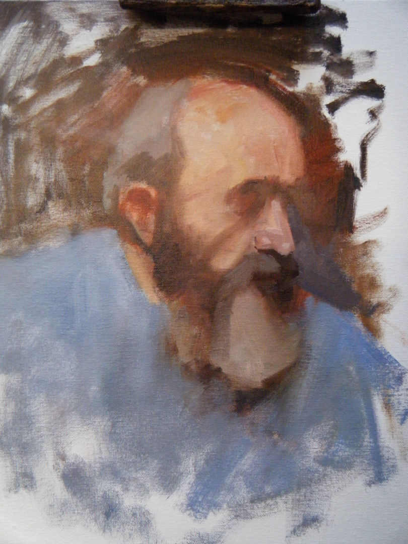
I threw in the general color and value of the shirt. I decided to start locking down the nose/mouth area and work my way out from there, making careful comparisons as I go on.

I got rid of the white of the canvas with some thin washes and wiped out/'fogged the areas on the left and continued to work carefully, stroke by stroke from the right side of the face.


Restated the shoulders to better express the model's gesture.

I used a palette knife to apply paint to the back ground and to place the head against the background. This helped to prevent those edges from getting too sharp.


The final result.
Sunday, January 1, 2012
Working on 'The Red Hat'
Since 2011 has now come to a close I will share my progress on the last painting I worked on in 2011, a self portrait. I wanted to try out a combination of an indirect/direct method, taking advantage of wet into wet painting and glazing over heavier paint application (see Rembrandt). I used acrylic so that I could experiment without having to wait hours for layers to dry. Since acrylic tends to level out after it dries, I used Liquitex's Super Heavy Body Titanium White so that some texture would be retained in the light, opaque areas. The colors used are Titanium White, Raw Sienna, Transparent Yellow Iron Oxide, Red Iron Oxide, Raw Umber, Burnt Sienna, Quinacridone Red, & Blue Black(Ivory Black with some Indanthrene Blue mixed in).


1. I started off with a charcoal drawing to establish the placement of the head in the space and to delineate the light/shadow areas. The surface is Canson Canva-Paper taped to a board. In retrospect I wish I had spent more time on this stage. I was in a hurry so I didn't realize how much the head narrows as it goes up from the mouth and chin. As you will see, this poor foundation creates some problems later on.

2. I covered the whole surface with a wash of Burnt Sienna mixed with some Red Iron Oxide to lock down my charcoal drawing. I then used diluted mixes of Raw Umber, Red Iron Oxide, & Blue Black mixed with Burnt Sienna to refine the drawing and lay in the shadow areas. Red Iron Oxide was used for the light areas of the hat.

3. I started to add the more opaque passages in the figure as well as the background to further establish the distribution of values. The play between the transparent shadows and opaque lights at this point gives a unique illusion of depth that I like. At this point I am happy with what the paint is doing but I am beginning to notice that the drawing is still askew...

4. Yikes. The red in the hat is much more punchy thanks to a mixture of Quinacridone Red and Red Iron Oxide. The faults in the drawing are now glaringly obvious; the face from the nose up is proportionately smaller than the mouth and jaw area. Years ago I would have been content to leave it as it is, but I remember the words of a great master that I can't seem to shake: NEVER KNOWINGLY LEAVE ANYTHING WRONG ON YOUR CANVAS. Thankfully the fast drying properties of acrylic allow for quick and extreme overpainting. I will have to make some drastic changes. I am a bit worried at this point.

5. I have re-established the outer contour of the face and restated the jaw area. I am simplifying the light and dark areas and removing traces of delineation where I can. Sometimes you've got to 'ugly up' a painting before it can start looking better.

6. I am still re-establishing large shapes and correcting the drawing. I cut down the jaw for a more accurate likeness (the chin in the last stage was much too strong). The background has been laid in more evenly with softer transitions. This will emphasize the higher contrast in the face.

7. More drastic changes, altering the shape of the nose and restating the eye and the eye sockets. The hat has been enlarged. A reddish wash has been applied to the nose and background in anticipation of future
layers and a light brown wash has been used to reshape the neck without actually restating the shirt. I applied more paint on the light areas with a palette knife and scraped away areas for a broken color effect. In this way I can give the opaque passages a richness similar to the transparent areas by allowing bits of underlying layers to show through. This is key because I have lost most of my initial transparent areas due to multiple repaintings.

8. The painting is starting to come together now. Within my value structure I am using color to emphasize the redder, yellower and greyer areas of the flesh. The paint is applied then partly removed, blended and softened with a palette knife or my fingers. I am going for subtle transitions within the larger light and dark shapes. Dark red washes have been pushed into the shadow areas. The shirt has been reestablished so the transition of neck into the shoulder structure makes more sense.

9. The painting as it now stands. The transition between the head and neck has been clarified and the eye in shadow has been more clearly stated. The outer edge of the face has been redrawn but subdued with the lost edges between it and the background. I redrew the shoulder and laid a dark red wash over the shirt area to simplify it; the contrast between its light and shadow areas were drawing attention away from the face. The shadow area of the hat has been redrawn to reshape the head and the light areas of the hat have been repainted. The mouth area has been restated, the contour of the lips is only clearly stated where its edge sharply meets the light area of the muzzle. The bottom lip is almost completely lost except for the light area on the left side. Red washes have been applied to the nose which helps to describe the translucent nature of the skin. The red on the nose and the mouth also provides a counterpoint to the intense red of the hat.

I have brought this painting to a place where I am satisfied with many of the areas (although there are many things that could still be refined). I definitely learned about the importance of tenacity and the willingness to achieve the desired effect by any means necessary. There were many times in the process when I thought the whole thing was going to fall apart. I have to keep reminding myself that I am the one in control and that no problem is too big to fix. The real question is 'what do I want?'
Friday, October 7, 2011
Lizzie
Here are some process shots of a painting I worked on for a few weeks back in August. It started as an idea in my head and evolved as I worked on it. This was an unusual painting for me because I rarely paint an image entirely from my imagination as I did here.

I started with a gouache sketch to get the basic design and pattern that I wanted. Because it can be re-wet, it's easy to move elements around and make large adjustments. This was the only reference I used for the painting because I wanted to make sure that I maintained the pattern of lights and darks.

Then I started the painting on an 18x24" acrylic primed MDF board. I didn't use a preliminary drawing except for some lines with the brush that I soon obliterated. I wanted to work the painting in terms of shapes rather than lines. This first pass was done with OMS thinned oil paint.

I went in with more paint and tried to give some form to the figure and the rock formations. I was very dissatisfied with how unconvincing the dress and the arm looked at this point so I decided to wipe them out and try again.

Here it is with the dress & arm wiped back to a simple pattern. I left those areas alone and proceeded to articulate the cloud(or smoke?) form making sub patterns with the blue-greens to suggest patches of sky and water. I made the hair mass look more wind-swept and believable at this point; it was looking rather heavy before. I also started popping in light red-oranges in strategic spots on the figure, especially around certain edges. I wanted to have a glowing halation effect around the skin to put some life into a rather cold picture.

The palette knife offered a sound solution to my struggle: I could create variation through texture within the masses while still preserving the proper value. I used the knife to paint the dress with subtle variations suggesting form and translucency in certain areas. The broken color and value shifts gave a satisfying shimmer to the dress. I also started knifing on an initial layer of white in the back. I planned on building it up further after it dried.

The finished painting. I really tightened up the face and built up some nice texture in the cloud/smoke mass that I lightly glazed over for a richer look. One nice thing is that I kept pretty faithful to the basic design. Any deviations from my original sketch were ideas that came to me mid-process and were (for the most part) improvements.
Thursday, February 17, 2011
Sargent Study Process II: Bone Dry
The next steps in the painting process, also taken from my camera phone (forgive the quality).


Unfortunately, it dried so the progress has halted here. The scan shows the texture well, but it messed up the colors a bit. If I work on this painting again, I'll have to apply a fresh layer of paint over the whole thing to take advantage of working wet into wet. It's not a total loss, however; with each one of these studies I learn all sorts of new things about manipulating oil paint.
Sunday, February 6, 2011
Sargent Study Process
A few shots from my camera phone of the progress on a Sargent study I'm painting:
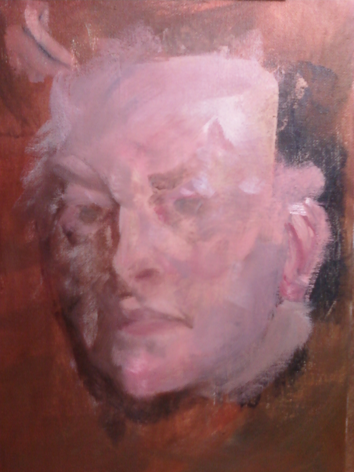


I'm using a fairly limited palette for this one: Titanium White, Yellow Ochre, Gamblin Alizarin Permanent, Rembrandt Transparent Oxide Red & Ultramarine Blue.
More to come soon.
Subscribe to:
Posts (Atom)

